
“There are no bad colors, just bad color combinations,” said one of my interior design mentors many years ago. At first I disagreed with him, since there’s a certain shade of brown-mustard yellow that I definitely wouldn’t want slathered all over my walls. But after I chewed on his statement for a bit, I realized that I had seen that color used in ways that were quite beautiful. It’s definitely possible to make any single color work in your home — it’s all in how other colors and materials are incorporated with it. But how do you develop a cohesive color palette?
Spend a few minutes browsing through the thousands of kitchens showcased on Houzz and you will quickly see they come in all shapes, sizes, styles and colors. Colorwise they can run the gamut from eye-catching, bold and bright, to light, tranquil and airy. Featured here are some of the many delightfully colorful kitchens on Houzz, along with examples of color palettes inspired by the kitchens.
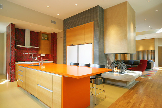
Warm Color Palette
Photo credit: Domiteaux + Baggett Architects PLLC
If you love lots of bright and bold colors but don’t want your kitchen to appear as if a rainbow exploded inside of it, consider working with analogous colors: colors next to each other on the color wheel.
A simple way to think of this is warm versus cool colors. This kitchen features very bold splashes of warm oranges and red. The space feels exciting and energetic — great for entertaining.
Photo credit: Jennifer Ott
Example palette: This potential palette features warm, analogous colors, plus a grounding neutral. Clockwise from top left (all from Farrow & Ball): Rectory Red, Charlotte’s Locks, Down Pipe and Pale Hound.
Bring your kitchen to life with color | Bedford NY Real Estate
Leave a reply

via inman.com